Sunday, 13 September 2020

Keep You Guessing?

 Hello my good friends - I.Ghost...

Here it is, page 6!


Page 6

The third panel (the long one in the middle of the page) was pretty tough. I drew it a few times before deciding it worked well enough. The impact of the enemy jet into the rock face doesn't have the punch or force that I wanted, but I thought I could re-work it if/when I ever clean it up.

The bottom panel is another example of some nice rock / environment drawings.  I really like how the mesa - the large, flat topped hill - turned out. You can see and understand the terrain. I think the shadows also really help.

Again, the flow of the jets through the shots looks clear and understandable to me, but if they don't to you, let me know, hey?!

One big challenge I had with this sequence is that I wanted to make it interesting and fresh, novel, but having never flown a fighter jet and not knowing anything about aerial combat tactics, I didn't really know what would be likely or even possible and I kept worrying that the action I was drawing and what might come next would be obvious to the viewer, but I think (I hope) I have been able to surprise you. 

Unfortumately, you'll have to wait for the next instalment (pages) to see if indeed it was predictable or not!

Anyway, I hope you like it.


Sunday, 6 September 2020

Little Lines Add So Much

Hello Hello!  

Here is page 5 of Flight of Fancy.


Page 5

Those cockpit drawings, tight inside the space with low angles are pretty tough. Creating a CG model of the planes and putting a virtual camera in there to get things looking right will really help. But that's waaaaay down the road, up in the air... choose your metaphor.

I like the 2nd panel. It turned looking really dynamic and the perspective works well too... I think it is because of the little lines in the background around the left-most jet on that helps make it look fast, shows movement, but also help suggest the perspective of the environment.

While doing more pages, I find sometimes the action gets confusing - which jet is that? Is that the good guy or bad guy? etc... Colour and decals on the jets would help, but I was also wondering if at the start of the book inside the hard cover, there are a bunch of drawings of different jets, labelled with a bit of info about what country uses those jets and then on the dust jacket there could be-

Slow down, Tiger!  Let's just get this thing drawn before we wade into getting it published!


Sunday, 30 August 2020

Reversals

 Hello hello!

And here, is Flight of Fancy, Page 4!!!

Page 4

So, two things... I've gone back into the first posting for this series and put page 2 at the top of the post, and page 1 below it, so that if you want to see them all in succession, go to the bottom of the first post, then scroll up, and voila, you can read them in order. 

And along that idea of reversals, I like how the flow of action happens between the 2nd last and last panels here... the pilot ejects from the jet, then we see the action lines as he flies and drops (through the panel border)  into the canyon wall in the final panel. It has a fun, circular feel, that even if you don't get the first time around, it is entertaining to "reread" the action there. Let me know if you think so too, or how it could be adjusted to be clearer.

I've done a few pages more, and am finding two things... A) it is hard to draw explosions - I think the inking will really help make them clear- dark on the outside, glowing flame roiling on the inside and B) I need to come up with more "sound" words... BOOM, CRUNCH, CRAK etc. gets a bit repetitive and are not very imaginative.

Sunday, 23 August 2020

Major Frost


Hello Faithful Reader (that's you, I.Ghost!)

Here, for your viewing pleasure, at least I hope you like it... is page 3!!

Page 3

So firstly, I wanted to talk about the name on the jet below the pilot in the first panel. I think they stencil the pilot's name on the jet near where they sit, I'm not sure they do it, but I thought if it is done, it would be a cool, clean way to introduce the name of the pilot. When I did it, I didn't think about the name much, just pulled something from the air, and then when I started discussing this comic in this blog, I thought... I need a title for this thing, and came up with "Flight of Fancy", thinking, ahah! The pilot's last name will be "Fancy". We'll see if it sticks. I'm open to other ideas.

What I like in this page is how I was able to create a kind of "face to face" dialogue between the pilots in their planes (in panels 2 and 3), and the last panel is good and dynamic and I think it "reads" logically and well - you can see the jet coming in, then banking, pilot responds and then the jet zips off the page.

I can see shading is going to make this work, to separate the jets from the background, to show how they are turning / rolling and also to suggest mood, as the shadow and shadowy jet do in the 3rd panel.

Something I keep doing, but think is wrong, but am not yet sure how to handle is the smoke trails behind the jets. I think I need them to show where they were, but I don't think there would be a contrail behind a jet flying low in an arid environment. 

Tuesday, 18 August 2020

Flight Of Fancy?

Hello faithful reader (Illustrated Ghost), among others!

I don't want to preface this post with much, and I especially don't want to make any grandiose statements about hopes and plans for this one, I just want to start it and talk about it, and with luck, see it through.

But what is it ?!!

It is, as Mr. Ghost requested, a longer format story. The working title is "Flight of Fancy". 

DON'T CUE THE TRUMPETS!  Please!  No fanfare.  Let's just do this thing... quietly.

I'll try to do a new post weekly and that will likely be just one page, but today, I give you two pages.


Page1


Page 2
 
Ok. REALLY rough. And as you can see, drawn on lined paper. I'm using cheap "exercise" books that have three holes and are staple bound. The lines are helpful for creating panels and the low quality of the thing means I am not very precious about it... yes, I still hesitate if I decide I need to erase a good drawing and better it, but less so than if it was done on nicer paper in ink.

Of course, hand lettered text that will probably change. Maybe at some point I'll figure out how to create my own font. Always wanted to do that.

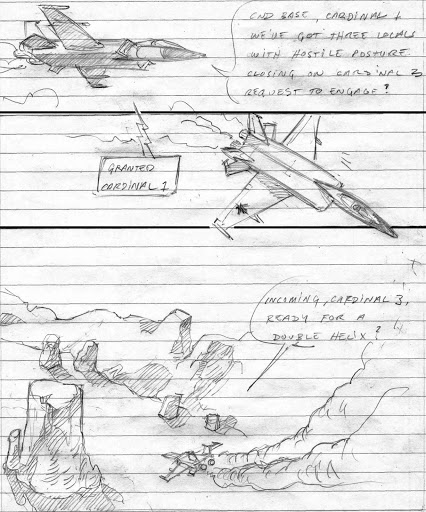
What I like about pages and what I've found pretty easy to do, is to use the motion and direction of the planes to "suggest" how the reader should move through the page. I find they read very quickly. I also like how some drawings and word bubbles cross over the panel lines. I think those "tricks" pop the viewer out of thinking of this as just a comic and also make the drawings/pages more dynamic.

The drawings of the planes are already better on the second page. I'm not entirely up on how they (Canadian CF18 jets) should look, but right now (in the early, rough, don't get ahead of yourself already stage), they'll do.

Surprisingly, I really like how the rocky landscape is going.They're fun to draw, and really enhanced with a bit of cross hatched shadows. 

And I'm also trying to employ the technique of putting something in the last panel on each page to inspire the reader to turn the page and keep reading. 

I hope you like what you see, I hope you like the next instalment, and I hope, without getting too much ahead of myself, that I can keep at it!