Monday, 1 February 2016

Striking the Match

As you know, I've been off the drawing wagon for a bit and am trying to get back on, but it's bigger than that. Lack of drawing is a symptom of feeling like I don't know what I should be creating and feeling a bit "aw what's the point, this project ain't going nowhere" sort of terrible attitude. It's a stupid, useless internal conversation that should just be circumvented with "if you want to draw, to create great. Do it. if you don't, don't. Whether it becomes something or goes anywhere is beside the point"  But I'm not doing either of those binaries, I'm going back to a different way that goes as follows: "You don't feel it now, just keep trying. Draw, think, remember, imagine and the fire might re-ignite, but also, try not to think this one to a final marketable product end goal.  Have fun".

So thing brings us to this page. Football players and bears, or rather, bears posed and built somewhat like football players. Without giving too much away, this is a character concept study where high-school/college students transform into various animals and a football player transforms into a bear.

But about this drawing, there are good strong poses, nice body forms, good lines of action but I really like the shapes of the bear. His arms, his feet, and how you can still see the bulk and how that bulk restricts his movement. You can also see the power it would have in his shoulders and to me I can also see how he might tower over others. 

What's that sound. Snick. Scrick. Sounds like a match being lit or something... Hmmm.


Thursday, 21 January 2016

Long Dry Spell

It's been a while since my last posting... aren't you supposed to say something like that at the start of confession?! Anyway, life changes got in the way. But here you go. Not a bad piece to mark my return to WoodPanels.

This was done at a poetry reading last night. I thought of filling a page with various lizards, but the idea or image in my head wasn't at all like this result. When I did the blue pencil sketch which filled the page pretty well, I forgot about doing a bunch of drawings and focused on this one. It took about an hour and a half, but as you might expect most of the time was spent shading.

What do I like about this one? I like pose, the "s" shape. Very sinuous and smooth. I like how you can see the form of the creature - it's roundness which is well described by the fine lines. I like the eyes, which I think are pretty convincing, especially the one on the left, how you can see through the cornea and see just the edge of the iris and pupil. I like the creature's proportions and anatomy - the extra long neck and his funny mouth that isn't happy or sad or any one thing. I like the different tonal bands that were done by shading some scales/ovals darker as opposed to drawing bands or rings around the body and then shading the whole section. That wouldn't have looked so subtle. I like the tiny horns for eyebrows, which, incidentally, are pretty much the only thing that came from my original mental image into the final piece.

The only thing I think would have made this one better would have been a bit of a shadow underneath the lizard, to place him on a ground plane. Other than that, not bad.

Thanks, Mr. I. Ghost for mentioning WoodPanels and my absence from it. I have been away from it too long and your words encouraged me to get back to it. I hope to post more and perhaps something more comic/sequential art related. 

Wednesday, 23 December 2015

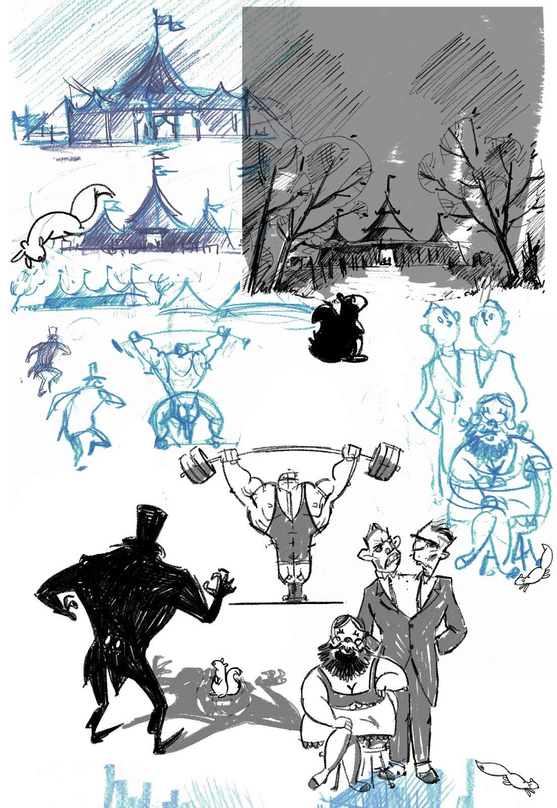
Follow the Squirrel


A bunch of us took a poem and did a "translation" or reworking or re-imagining of it.

This is my version. I hope you can see it/"read" it. I'll not say much about it because I think the fun of it is just trying to tease it apart, to grab a meaning out of it. I hope you can, but don't worry, I won't help you out if you can't!

What do I like about it? Lots of things but the most important thing is the line work (the scratchy black lines - the blue and purple lines are my roughs). Using a brush that looked (to my eye) like a pencil or crayon texture I was able to produce loose, easy lines. I consider that something of a breakthrough as (maybe you know) I find inking on a Cintiq rather hard. I think quality of line can make a drawing appealing or not and I've worked so hard to develop that and need to re-learn how to produce that on a Cintiq.

In the book "Through the Woods", Emily Carroll has produced interesting stories with excellent pacing and very little writing which I think helps the viewer to investigate the drawings more, to dig into them and not be distracted or pulled away from the drawings by the written words. With luck, My piece has done some of that.


The images above are nice, the flow is good and I think the pacing is good too. As the "reader" I think there is room to breathe and take it all in.

Wednesday, 9 December 2015

Whole Briefcase Full Of Versions


Hope you can see all the drawings above. But if you can't you probably can't see the first one very well, which is the worst!

So lookit this. Lots of versions. What's going on?

Number 1 was way off... I could tell the design was terrible and I needed to try again. I flipped the page over and did #2. I liked the fat gangster on the left ("Lefty"), wasn't sure about his action, but didn't like the one on the right ("Righty")- he didn't seem nearly tough enough. 

Version #3 was getting there. Lefty looks good, I liked his face and his body looks bulky enough. I got rid of the action of him buttoning up his jacket because I wasn't sure it was reading. Righty looks cool and handsome, which I really liked but knew he should be riffling the bills as was suggested (though poorly drawn) in version #2.

And then as the sun was going down, I decided I had to wrap it up and did version #5. I put the suit buttoning action back in on Lefty - it somehow felt right, like they're getting ready for business. I tried tilting Righty's head and put the riffling bills action on him. It took a few go-rounds before I got something that looked convincing and was read-able.

... and then the inking - version # 5. Not much different there. I returned Righty's head tilt and body shape/line of action back to how it was in version #3, and widened Lefty's body a bit.

It's all an effort to keep going till I get there, till it looks like I imagine and I think I did.

Sunday, 29 November 2015

A Bit 'O Colour

Another month, another Orchid Society Cartoon, and yes, there is a bit of colour!

You can see the concept and drawing was pretty well sorted from the start (drawing 1).

Drawing 2 (the little bit at the top left) shows some interesting things. The little tiny alien shows how I changed the design slightly by altering the proportions and trying to add a line of action through the body. I like how that little one turned out more than I like any of the other larger alien drawings. You can also see I was working on the design of the flying saucers, the panel layout with the "translation" panel across the bottom of the cartoon (not shown in these roughs, but is present in final) and the alien's language.


Panel 3 is the rough for the final cartoon. I really like the flying saucers shooting at the buildings. When I did it, I was reminded of a time WAAAY long ago when I was drawing with another kid who was drawing a war scene. As he drew a tank shooting at a few soldiers, he made gunfire sound effects. Next time you draw something like that, try making sound effects. It might not improve the drawing but sure makes it more fun to draw! Pew, pew pew go the flying saucer laser bullets.

And the last one (drawing 4) was initially done in grey tones, but got thinking about Mr. Illustrated Ghost's ongoing request for colour. I had an idea of how the colour should be, so just went for it.  It's pretty good, but now that I look at it, I have a problem... what's the rectangle on the floor? Is it a carpet or light coming from the window? I meant it as light, but if so, why isn't that light being blocked by the aliens and then why are their shadows under them, not stretching to the bottom left with the light? Yes, I agree, let's say it is a carpet! It was during the inking that I made the alien's pupils rectangular which is kind of interesting.

The dialogue (or translation) was difficult to make short but say everything that needed to be said, but lucky for me, Christine helped out. I like how a part of the alien's language is in the translation which suggests that word or phrase cannot be translated into anything meaningful to humans.

And here's the final piece.